
Un mensaje de Julio Anguita a la gente que va a votar a PP y PSOE
Lo típico que pasa justo el día después de cambiarle a tu coche el seguro de todo riesgo a terceros…
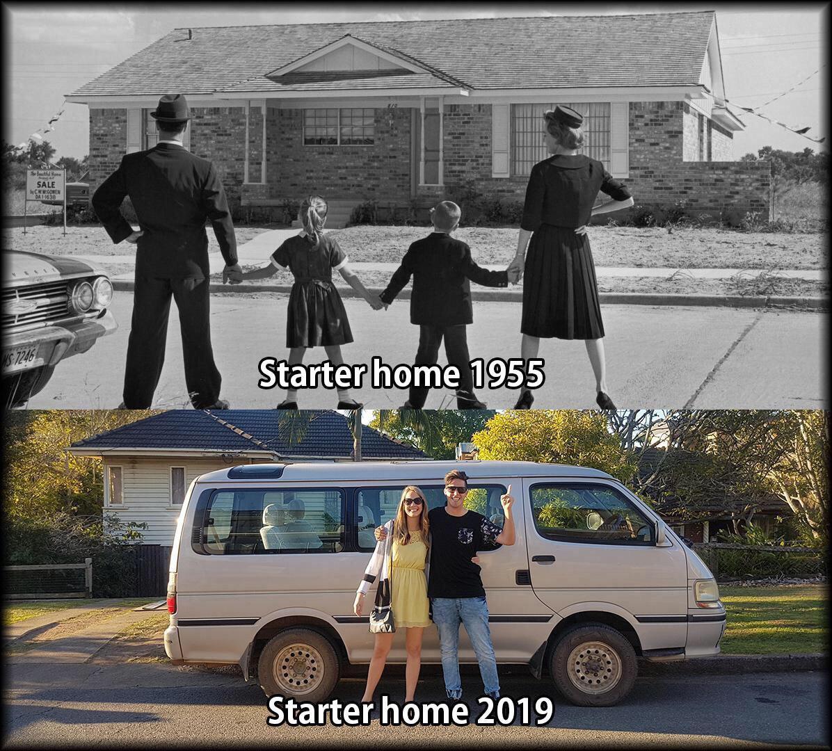
Dios busca formas creativas para que los retardeds no se reproduzcan

Emisiones de gases invernadero desde 1850 hasta hoy.
Con es cala de colores:
Animated map showing the change in greenhouse gas emissions / person since 1850, relative to the boundaries of modern countries. pic.twitter.com/aOYqdo2wfk
— Robert Rohde (@RARohde) April 4, 2019
Estilo ranking:
Animation showing the changes in national total greenhouse gas emissions by country from 1850 to 2016.
Data source: PRIMAP-hist v2.0. pic.twitter.com/tFhNXgAexy
— Robert Rohde (@RARohde) April 5, 2019
Errores de películas: AQUAMAN
Un vídeo creado por Agujeros de Guión (Guionista enfurecido) y Canal Random.
Crítica y resumen:
Parte 2: